
JUS
Juice Up Saigon

Overview
JUS (Juice Up Saigon) is a raw, cold-pressed juice brand founded in September 2015 by three individuals sharing a passion for healthy living. Born in Saigon, one of Southeast Asia’s most dynamic cities, JUS offers a simple, delicious, and practical way to integrate plant-based nutrition into everyday life.
As a pioneer of cold-pressed juice in Vietnam, our mission was to define a sustainable and distinctive visual identity for the brand. Inspired by the equilateral triangle in yoga which symbolizes the balance between body, spirit, and mind, we developed a unique triangular bottle as a core expression of JUS’s philosophy that stand for balance and purity.

Logo
JUS logo was design simple as it needs to be with organic curves and unbalanced weight-arms to create the natural visual identity for the brand due to its organic ingredients.
This visual language reinforces our brand’s commitment to using only the freshest, high-quality ingredients.
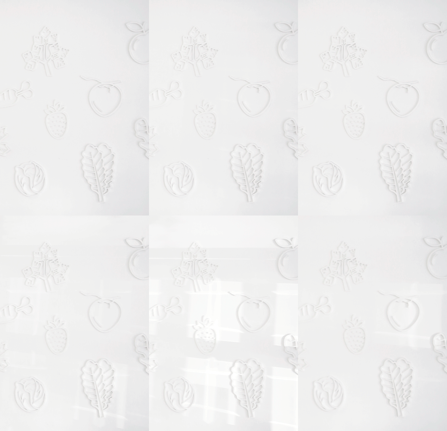

Icon system
The icon system is a visual tribute to the natural ingredients behind our cold-pressed juices—fruits, vegetables, and botanicals. Each icon is a clean, stylized expression of a key ingredient, conveying purity, naturalness, and nutritional value.
Paired with a vibrant color palette, the icons enable instant flavor recognition and adapt seamlessly across all brand touchpoints, reinforcing JUS’s commitment to fresh, high-quality ingredients.


Store Interior Direction
The store is designed with a clear intention to balance minimalism and its urban context. Using local materials and a dominant white palette, it creates a modern contrast against the surrounding French colonial architecture, allowing the brand to stand out subtly yet effectively.
The open, airy space functions as a calm urban oasis, immediately conveying the purity and freshness found in every bottle of JUS.


